Frosty Snow Tutorial

I've recently learned several methods for adding haze to a photograph. Sometimes you want your pictures sharp, sharp, sharp, and other times you want to add a little atmosphere. There are several methods for adding light, haze, or mist to your photos using Photoshop.

In short, here are two major methods for adding haze:

1 - Curves

Open up curves in either Adobe Camera Raw or Adobe Photoshop and pull up the left corner of your curves adjustment until you like the effect (usually about halfway). Then make adjustments for contrast and dark colors to bring back the details which are lost in the haze.

2 - Levels

Open up a levels adjustment layer. Pull the bottom black slider to the right until you get the desired effect. Then make adjustments for contrast and dark colors to bring back the details which are lost in the haze.

A Frosty Tutorial

Here, I walk you through my process of adjusting one of my images to add more of a haze effect to the photo. This particular photo was taken in a blustery moment during a snow storm and I wanted to capture the feeling of fog and blowing snow in my image.
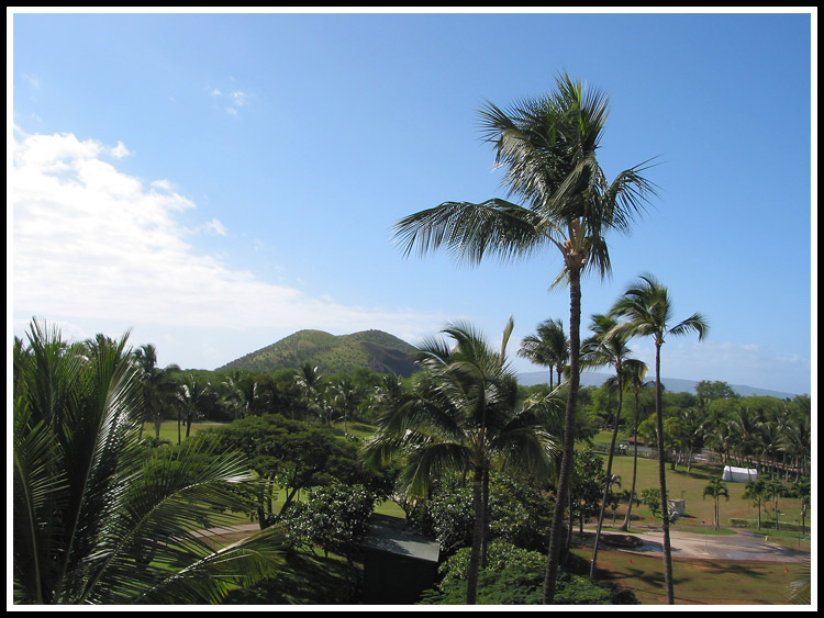
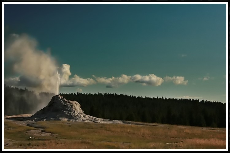
Original Photo


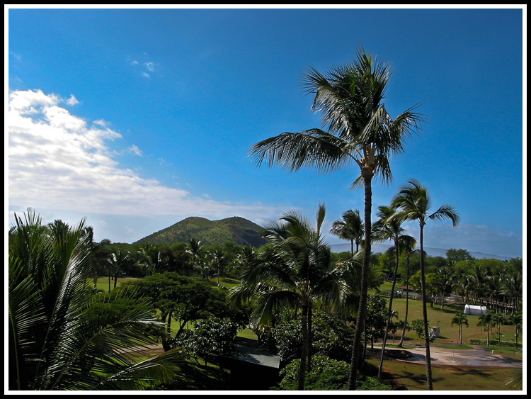
The Final Frosty, Snowy Photo


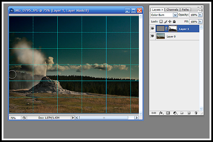
Step One, open up Curves in either Adobe Camera Raw or Adobe Photoshop (I use Adobe Photoshop CS6). Use a curves adjustment layer in order to make changes non-permanent if opening in Photoshop. Above, I open up curves in Adobe Camera Raw.

You will want to pull up the left hand side of your curve as shown in the above photo. Do this until you get the desired (but not finished) effect.

Step Two, you will want to adjust the image to bring back out the colors, darkness, and details. I prefer to do this in Camera Raw. So, after adjusting my curve in Camera Raw, I head back to Basic adjustments in Adobe Camera Raw (as seen above). Pay attention to exposure, contrast, shadows, blacks, and vibrance. I also upped my highlights on this photo to try and bring out the snowflakes more clearly.

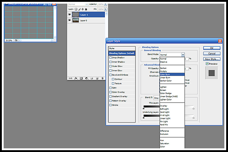
Step Three, now head over to Photoshop to make your adjustments. One of my favorite, quick ways of adjusting photographs is to add a new adjustment layer and create a screened and a soft light adjustment layer. I set both of these layers to around 20-30% opacity. The "screen"ed layer adds more of a light effect to your photo (and a bit of a hazy effect in and of itself). The "soft light" later makes the colors more vibrant. To add a layer go to your "create new fill or adjustment layer" button and click on it for each layer (the button is a half dark/half white circle at the bottom of your adjustment layers box). To make your layer have the screen effect, click on your new layer and choose "screen" from the adjustment pull-down box. Set the opacity to around 30% (you can adjust it after making your soft light adjustment layer). To make your next layer have the soft light effect, click on the next new layer and choose "soft light" from the adjustment pull down box. And adjust opacity to your liking (I suggest around 20%), making sure to go in and tweak the opacity of the screen adjustment layer again to your liking now that you also have the "soft light" effect.

Above, you see my two new layers, one with a "screen effect" applied and one with the "soft light" effect applied.

Now we're almost done.

Step Four, the last thing I want to do is adjust the colors slightly. In the case of this photo, I want my colors to be a tad stronger (due to the hazy effect) and I want the photo to be slightly blue because I am attempting to capture the feeling of snow. If I were doing a hazy photo for a sunny day, I would try and the blues out of my highlights and get a slightly yellow effect.

Open up a curves adjustment layer (choose Layer > New Adjustment Layer > Curves from the upper menu system and click OK). You will want to click on the RGB pull down menu inside the curves dialog box, and adjust each of the Red, Green, and Blue layers. To the red and green layers, I suggest just pulling the middle of the curve up slightly (very slightly) to give the colors a bit more pop. You could leave these layers alone, it wouldn't make a huge difference, but play with them to your liking. The key to getting the blue feel is the blue adjustment layer, as shown above. Once you select your blue curves layer, you will want to pull the upper right hand side of your adjustment layer slightly to the left. And you will want to pull up the left hand side of your adjustment layer slightly, to your liking.

And that is it.

Fall Flowers

I'm in love with the flowers that survive into the Fall season. It's been on and off Indian Summer this year and I've enjoyed every sunny day.

snap_dragon

fall_strawberry_2

rhoddy_leaf

fall_rose

black_eyed_susan

A Photo Shoot For A Friend

A friend agreed to allow me to shoot her family here recently. She has a little boy just younger than my son. Her youngest daughter is my older daughter's age, and her older daughter is my step-daughter's age. It was so much fun to shoot someone outside my family.

I was itching for some new equipment after that. It really made me wonder how you achieve professional studio lighting without breaking the bank. Here are some of my favorites from the shoot. Most of my successful shots were shot with my flash bounced off the ceiling or else they were super closeups of the baby under my lights. My lights are 250watt each and while they seem to blind the subject, they don't end up being nearly bright enough for moving subjects.

Her baby boy is an absolute doll.


aiden_mommy_2


aiden_mommy

aiden_9

aiden_8

aiden_6


aiden_1

siblings_4

siblings_2

siblings_3

aislynn_favorite

alaina_2

Playing Around

I've been playing around with Photoshop tonight. Mostly, I've been playing around with this tutorial:

http://pshero.com/photoshop-tutorials/photo-effects/calculations-and-colorization

The tutorial is all about converting to black and white using Image > Calculations, and then adding a gradient to the black and white image.

The Calculations method of converting to black and white is really dramatic and super easy. There are so many interesting methods of converting to black and white. One of my other favorites, I write about here:

http://createdforinspiration.blogspot.com/2009/03/black-white-baby-portrait.html

But, this method seems simpler to me and gives you a different result.

Of course, you can also simply:

Image > Adjustments > Desaturate.

Or,

Image > Mode > Grayscale.

Or,

Create An Adjustment Layer (Round Black/White circle at the bottom of your layers pallette) and choose Black & White from the pull down menu, and play with the sliders.

Or,

Create An Adjustment Layer and choose Channel Mixer. Then, click the Monochrome box in the Channel Mixer and play with the sliders.

Here are some images I made tonight with the Calculations and Colorization tutorial listed above. I used the exact tutorial on my flower pictures. Then, I used the high contrast black and white conversion using Calculations to adjust some photos that never quite showed the full range of colors or contrast that I saw with my eyes, using different blending techniques (soft light and overlay and different combinations of opacity for various layers).

calculations_gradient_red_lace

calculations_gradient_green_lace

calculations_olympics

yellowstone_blue_stream

Even enhanced here in Photoshop, this photo didn't do justice to the BLUE, BLUE stream I saw here at Yellowstone. Unfortuneately, we drove by it at noon day and then stopped by when the light was lower in the sky. The irradescent blue bacteria in the stream were really cool.

yellowstone_grand_prismatic

Truly, the Grand Prismatic pool at Yellowstone has all these colors and more. It's a sight to behold. Make sure, if you ever go to Yellowstone, to stop at this one.

Fix It Friday - Little Girl & Doll

It's Fix It Friday over at I Heart Faces. This picture with the girl and her doll is precious, and captures perfectly what being a little girl is about. I have two renditions for Fix It Friday: one with increased contrast, texture, and a text; the other in black and white.


Here's the original.

girl_and_doll_orig

Here's the color "Fix It".

girl_and_doll_fix_it

Here's the black and white.

girl_and_doll_bw

I Heart Faces - Angles

This week's theme at I Heart Faces is angles. So, I submit a photo I took at an interesting angle. This photo was taken just after a late spring rainstorm and jumping in puddles and being silly is a lot of fun after it rains. So, I got a lot of fun photos on this particular day.


fun_in_the_rain

Photoshop Shapes

I came across a Photoshop Shape Tutorial. Photoshop actually has quite rich shape features. They are a lot of fun to play with.

Here is the link:

http://www.showandtell-graphics.com/fun-with-shapes.php

Here are some images I made with the technique:

shapes_1

I Heart Faces - Bundled Up

I Heart Faces theme this week is "Bundled Up". This photograph popped right into my mind. It is one of my absolute favorites. I love the rich tones and the sweet moment in time when my littlest girl was all bundled up. Although we had no snow to speak of this year, I think this photo describes that theme perfectly.


bundled_up_750

Enhancing Skies

Thanks to Marla, I learned a second method for enhancing dull skies. Part Two of this tutorial: http://www.layersmagazine.com/exposure-blending-in-photoshop.html

This technique is also good for high contrast photos that have heavy shadows and heavy highlights. It brings out the details in the photos that are typically missing in deep shadows or bright highlights.

Basically, by opening your RAW image as a Smart Object, you are able to create a second version of your image which you can adjust with Camera Raw. Then you apply a adjustment filter to it, to hide portion where you want to use the original settings from your first Camera Raw version of the photo.

I compared this to the other technique I learned for enhancing skies...which is to add a second layer at 50% grey, apply color burn, and make an adjustment layer to get back your original image for the non-burned layer.

Just for fun, I played around with these two techniques to compare them. I took an old photo from Hawaii and applied the two techniques. Basically, the Camera Raw/Smart Object version seems to restore the actual details of the sky. The Color Burn version seems to be an artistic addition to your photo. It produces slightly unreal colors in the sky...but color popularly seen in digital photography today. Here are the versions...

hawaii_orig_jpeg

Original

hawaii_raw_save_as_smart_object

Camera Raw/Smart Object

hawaii_skies_enhanced

Color Burn (again this technique brought out the noise, so I ran the Noise Filter on it when done)

Neat Trick - Enhancing Skies

OK. Here's a neat trick that I read about in one of my Photoshop books. If you have a washed out sky, you can darken or intensify the sky pretty easily. I did notice that it intensified some of the noise of my original picture, but the effect was minimal and my camera typically has some noise with sky pictures.


  • Add a layer above your picture and fill it with 50% gray
  • Choose a Blend Mode of Color Burn. (To get to Blend Mode right click on your 50% gray layer and choose Blending Options. Blend Mode is one of the top pull down menus.
  • So that the rest of your picture isn't darkened too much, make an Adjustment Layer (the "square with a circle in it" icon at the bottom of your Layers Palette) and using a soft black brush, fill in the areas of your photograph that aren't the sky.
  • Adjust the opacity of the 50% Gray Layer as necessary.


Here are a couple screen prints of the process, followed by a before and after shot of a enhanced sky on a photo.

old_faithful_screen_print_1

old_faithful_screen_print_2

old_faithful_original

This was the original.

old_faithful_enhanced

This was the enhanced version.

old_faithful_noise_filtered

This was the enhanced version with Noiseware Community Edition run on it.