Reflection


I didn't give this week's topic at iheartfaces.com much thought until about a week ago. This week's theme is reflection. And, of course, it has to be a reflection of a face, because it is iheartfaces. I couldn't use a picture of a reflection of a bridge, for instance. I didn't think putting up another version of last week's self-portrait with kids would be a very interesting post. I was stumped.

But, at dinner tonight, my toddler discovered her reflection in the pot at the family dinner table. I grabbed my camera and took a picture of her looking at herself. Do you remember gazing at yourself in shiny curved objects like pots and spoons and such and being mesmorized when you were a kid? Well, I do. So, here is my picture of my littlest girl fascinated by her own reflection.

reflection

Photoshop Sharpen

I managed to eeek out a decent picture with this one.

The original is below in the first picture. It's a little too blurry - especially in the face and the feet, because the little guy was moving and I was using existing light coming in through a window. You can really see it if you click on the image and go to the bigger image.

baby_toes_originial

Here is my Photoshop alteration. First I changed Camera Raw settings - upping the black, upping the contrast, upping the intensity and then adjusting the exposure to match. Then I converted it to black and white using my baby blown out method for black and whites making my solid color adjustment layer just about 20%. As usual, I adjusted curves using an S-curve and adjusted levels to my liking. I applied an unsharp mask to the picture to my liking. Then, after merging my layers, I duplicated my layer and made a layer just for sharpening the eyes a tad more. Last, I added a bit of sepia type color to the photo by going to Photo Filter and choosing a color (in this case mine was a deep brown) and adjusting the density to my liking.

Below is the new photo. If you click on it and choose the larger sized photo, you will see that it still looks pleasing even blown up.

baby_toes

You Capture Challenge - Letters

I am participating in this weeks You Capture's Challenge - Letters.

Photobucket


Here is a favorite picture of mine with some wonderful letters in it.

Toddler Adoration - Love

Fix It Friday - Baby Picture

I Heart Faces is featuring a cute little baby picture to fix with Photoshop for Fix It Friday.


Here is the original:

baby_fix_it_friday

Here is my first fix - a sharpened up color version:

baby_fix_it_friday_natural_color_fix

Here is my second fix - a mostly black and white version, with a touch of color and a blue tint.

baby_fix_it_friday_blue

Here is my third fix - a black and white conversion with a blown out look. I just love the blown out look with babies. You can read about how I do this here.

baby_fix_it_friday_blown_out_bw

Grass In Motion

I really liked these photos for some reason - especially the first one - it speaks motion to me, not just blur.

grass_motion

grass_contemplation

Second Self-Portrait With Kids

Well, I could only have one kids self-portrait entry for iheartfaces. But, here is the second picture I took. This one is of my other daughter. Her eyes to me, are so striking. Always. My other daughter, in the background, adds drama to the picture I think with her sad face. It's amazing how sad kids get when it's the other one's turn at something - even though they just had their turn. At least they are honest with their feelings.

rachel_self_portrait

I Heart Faces - Self Portrait


Here are my entries for this week's i heart faces - pretty challenging considering I broke my wrist a little over a month ago and we weren't allowed to use a tripod. But, I was inspired by everyone's creativity with this topic. And, I think I had a little creativity myself.

Here is my adult entry:

self_portrait

Here is my kids entry - my daughter and I (and another daughter there in the background):

self_portrait_kids

Easy Photoshop Texture Tutorial

I've actually just recently learned a technique for using textures with my photos. Here is an easy (I hope) tutorial for adding textures to your photos.

I'll start with two photographs - one, the picture I want to showcase, and the other, the texture. Here they are:

cows


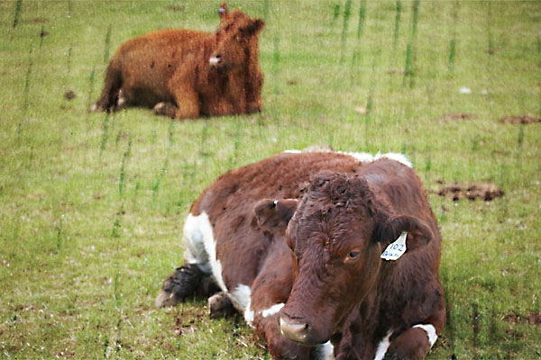
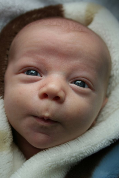
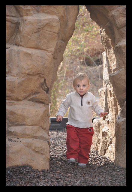
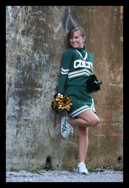
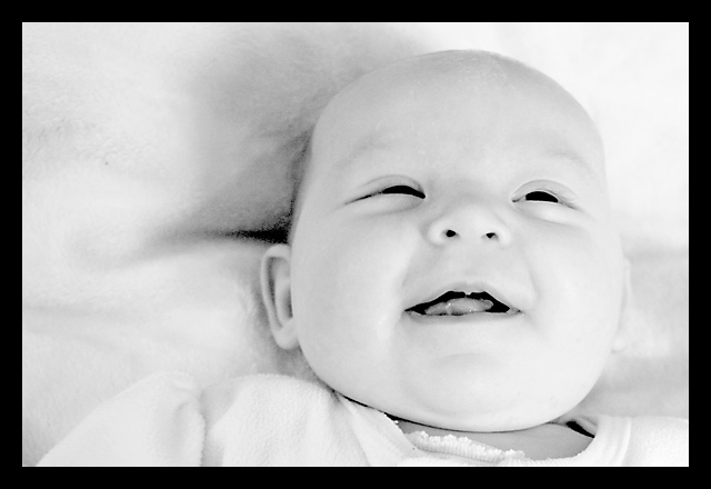
The cow photo - I wanted to showcase
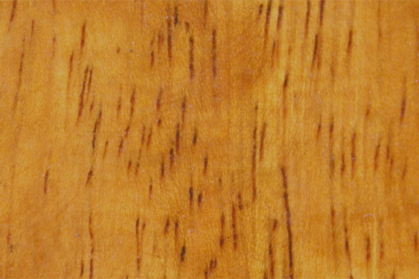
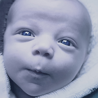
cows_texture


Texture photo

For your texture photo you can take a close-up picture of most anything. Here in this blog entry I used a tree for the texture. Paper, wood, rocks, anything repetitive make good textures. Or, you can get a texture from the web from a site like Mayang's Textures.

I took the texture photo and tweaked the levels, the contrast, and the curves of my texture and then desaturated it until it looked like this:

cows_texture_altered

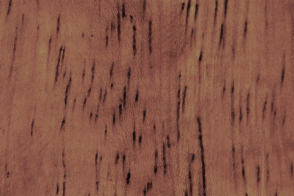
My original photo looked too saturated and didn't have enough contrast (detail) to make a good texture when combined with my photo, so I changed it. You may or may not want to alter your texture. That's up to you.

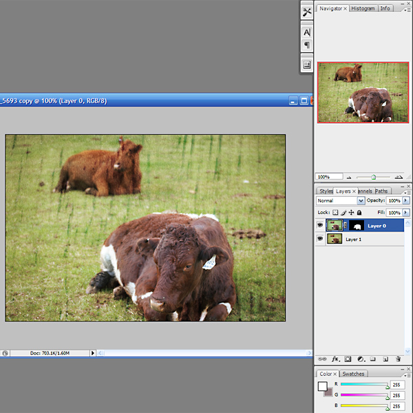
So, I take my original photo and duplicate the background layer. I make sure my texture photo is the same size as the photo that I want to add texture to. In this case they are both 600 px by 400 px. Making sure than my image is flattened (all one layer), I Select-All (CTRL-A) and Copy (CTRL-C) my texture photo. I go over to my original photo and I Paste (CTRL-V). This will create a third layer on my original photo. The first two layers are the original photo (the cow), the third layer is the texture.

I make sure the texture layer is on top. I RIGHT-CLICK with my mouse on the texture layer and choose BLENDING OPTIONS (the second option in the pull down menu). In the main screen under BLENDING OPTIONS there is a header that says GENERAL BLENDING. Blend Mode. Click on the arrow after Blend Mode and you will get a pull down menu where you can choose the option OVERLAY. Click on Overlay. This creates the texture. You can adjust the opacity of this to your liking using the opacity slider in the main screen of the BLENDING OPTIONS box.

At this point if you look at your image, the whole image has the texture on it. In most cases, this is probably not what you want. You want your subject to be sharp and not to have a texture on top of it. This is why I made an extra copy of the original photo (the cow). Now you will want to make sure that the EYE to the left of the layer is off for the bottom layer and on for the top two layers. This makes one of your original photos non visible. Go to the pull down menus and choose Layer >> Merge Visible. This will give you two layers now - the newly merged textured photo (of the cows with the texture in it) and the original. At this point, you will turn the visibility (click on the square next to the layer to make the EYE appear) to your original layer.


Now move the original photo to the top layer. Click on the layer thumbnail of the original photo, then ALT-ADD VECTOR MASK (Alt-the rectangle with the circle in it). This will create a mask on this layer and make the layer disappear on the main image. Now you will color in the part you want from the original (the non-textured picture) with a white paintbrush. The original photo will show through the photo. This is the same technique you use to sharpen just eyes in a photo (which I learned from iheartfaces.com). Here is a screen shot from this point in the process.

cows_texture_directions

Once you have the effect you like, you can merge your remaining layers and do a final sharpen if necessary on your final photo (unsharp mask). I tried to be thorough, yet simple in writing this tutorial, but if you have any questions or suggestions about this technique, just ask.

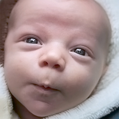
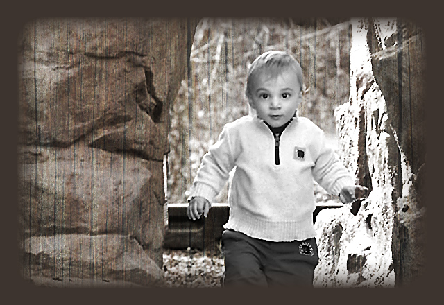
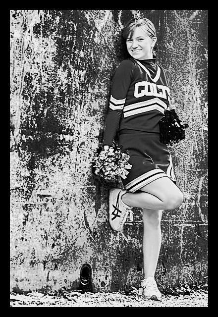
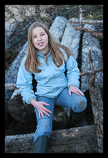
Here's a final image:

cows_textured

Fix It Friday - Original, Black & White Fix, Color Fix, Texture


Here are my fixes for iheartfaces.com's Fix-It-Friday.

Here is the original:

fix-it-friday_orig

Here is my Black & White fix:

fix-it-friday_bw_blue

Here is my Color fix:

fix-it-friday_colors

Here is one with Texture and a Vignette:

fix_it_friday_vignette

Iheartfaces Spring Entry

Here is my photo for this week's iheartfaces, amateurs category. The theme is Spring. I love the contrast of this little outfit on my youngest daughter. This was a bright sunny day at the park. My kids were thoroughly enjoying themselves.


At The Park

Selective Color Edit

I couldn't help but edit this photo for selective color. I did this selective color a bit different than I have in the past. In the past I've done selective color edits by and selecting the object I want to keep with one of the selection tools. Then I created a second layer and posted that object there. And I desaturated my initial layer.

I wanted the reds/magentas/blues in this image. So I chose a hue/saturation adjustment layer for yellows and greens and desaturated those. I chose hue/saturation for the cyans/blues and changed the saturation and the hues on these to my liking. I had saved another copy of the image and made a black and white coversion of the image. Then I pasted my partially desaturated image as a new layer on the black and white image and adjusted the opacity of that layer to my liking. I also made a copy of the partially desaturated image and altered the brightness/contrast and sharpness on this layer to my liking - looking mainly for the effect on the eyes, but also some of the blue on the piano and the red on the nose. I created a layer mask (alt-layer mask button) and painted white on the black of that mask on the eyes. Then I made the opacity of my paintbrush lower (like 30%) and painted some over the nose and the blue reflections on the blurred out piano. That gave me a little more color to these items, but allowed it to blur in nicely.

Below is my edit:

berry_sauce_small

This is the SOCC version:

SOCC Berry Sauce Picture

Sisters and Friends

This is my entry for iheartfaces.com. This week's theme is friends. This was taken about two years ago. I love how Rachel is leaning on her big sister, Natalie.


friends

Sisters and Friends

Pictures I Love

I was going through my compact flash card trying to pair down pictures on it today. I can't delete them yet because I haven't put them on at least two computers (both of which have redundant hard drives or RAID). That's my rule. My photos are priceless to me. So, I was going through to see if there were photos that weren't so great that I could delete so I wouldn't keep getting the CF Card Full message. I hate that message, don't you?

Anyhow, I noticed a bunch of pictures from my husband's birthday - that I just LOVED. I hadn't done anything with them because my computer was down in February. Can you say..."thank you redundant hard drives"?

birthday_1
I love upping the blacks in Camera Raw and adjusting brightness and/or contrast to compensate.

birthday_2
This one is all composition. I was happy with the black and white conversion on this too.

birthday_3
I just love this picture above. I love it despite the clutter and the reflection of me taking the picture. I just love the pure enthusiasm of my daughter, giving a present to her Dad.

birthday_4
Yummy dinner. Nothing too special about this picture - except to say I like when the focus on food is closer rather than farther away - notice how the focus is in the front of the bowl.

birthday_5

Fix It Friday - Black & White, Color, Desaturated

It's Fix-It Friday at iheartfaces.com. I love doing this because I get a chance to play around with someone else's images other than my own.


Here is the original image, which I think is a great image to begin with:

senior_spirit_original

Below is my black and white conversion for this. I couldn't use my stand-by black and white conversion method by itself on this one because the green of the outfit didn't show up dark enough in my conversion. So, I used a combination of methods.

First, I duplicated my layers and partially converted to black and white with the channel mixer, by clicking monochrome in that tool and playing around with it until the green outfit was nice and dark, and stood out from the background. I made this layer partially opaque and combined my layers. Then I used my standby method:

Changing to lab color, then grabbing the lightness channel, then converting to greyscale, then selecting, then selecting the inverse, then going back to RGB, then adding a solid color, choosing black, and reducing the opacity of that layer.

Then the look of the girl's skin was a little off. I had saved a copy of the channel mixer version of the black and white image. I copied this into a new layer. I selected that layer and chose alt-channel mixer button (square with round circle in it). I painted out her skin in select spots to make the tones normal looking. And combined my images. I also did some sharpening.

Here's the "fixed" Black & White version.

senior_spirit_black_white

Here's my fixed color version. First off, I made a selection of the girl and saved it seperately and changed the curves, color balance, and levels independently. Then I took the main image and altered the background to my liking without worrying about the effect on the girl. I did a numbere of things - exposure, curves, color balance, and levels. One thing of note that I did to the background is that I selected a color out of the wall behind the girl and added a solid color to that background using a similar color as the orange rust circle on the wall. I, of course, had done this on a duplicated layer and so I then reduced the opacity of the orange effect until I liked it. After combining this main image, I adjusted the sharpness using Unsharp Mask on the main image (independently of the girl). I copied the girl back into this image, flattened the image, and then fine tweaked the final sharpness.

senior_spirit_colors_enhanced

To desaturate this, I chose Hue/Saturation a couple of times and desaturated in there for select colors.

senior_spirit_desaturated

Texture and Light Tones In Photoshop

Here are two photos I just Photoshopped.

With this first photo, I found that I could use the black and white conversion technique I share below. Except instead of selecting the inverse selection - I use the first selection. Step 6 in the previous blog entry. Then when I add a solid color to the photo I choose a light color (usually white) instead of black. This gives the softer more blown out look common in baby portraits. I liked the effect on this photo.

baby_bw_laugh

With the second photo I was playing with textures. I had a tree image I used as a texture. I duplicated the background file of the main image. Then, I added the tree as a second layer. Then I chose blending options (after right clicking on the tree layer), and under General Blending, I chose Overlay and played with the opacity till I liked the effect. Then I took the background layer and moved it on top of the overlay (texture file). (I selected layer from background and moved it to be the top layer.) Then I Alt-Layer Masked (circle with square in it). I chose I white paint brush and painted over the subject of the photo so that the texture didn't apply to her. I merged the file and saved.

riah_texture